2026
DadWell Wellbeing App
Most of the work was deciding what to leave out.
Product and delivery lead
Mobile app
Role
Timeline

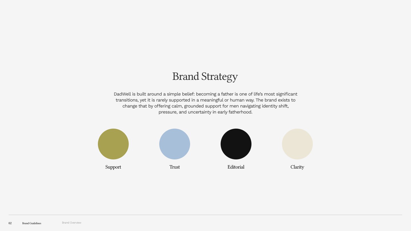
DadWell is a wellbeing app for new and expectant fathers. I took it from an unbounded scope and a legal minefield to a locked V1 on a date, closing the blockers one at a time and putting an owner against every deferred item.


The problem
DadWell had a clear reason to exist and no boundary around it. The founder wanted an app that supported fathers through pregnancy and the first year, and every conversation added something: mood tracking, community, weekly guides, a partner account, an EU launch.
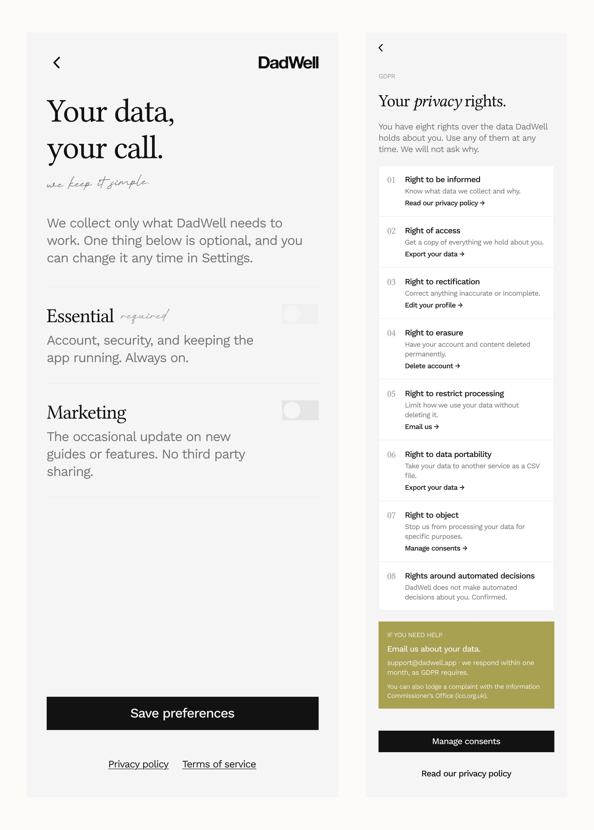
Underneath that sat a harder problem nobody had costed. The product handles health data about a pregnancy, has a community feature, is sold on subscription and was heading for two jurisdictions at once. That's a stack of legal obligations, and none of them had been written down.



What I did
I turned the compliance risk into a document before it became a delay
I wrote up every legal and technical blocker as a numbered list with an owner and a decision needed, and took it to the founder as a deck rather than a conversation. There were thirteen items, each one fact-checked against the primary source rather than a summary, which caught three of my own claims being wrong before they reached him.
I cut the EU out of V1
Shipping into two jurisdictions doubled the compliance work for a product that hadn't proven anyone wanted it. I proposed UK only for V1 and moved the EU into V2. It was the single decision that made the launch date real.
I kept the change request honest, including the parts that were already ours
When the founder asked what the extra work involved, the admin panel and the moderation work were already inside the agreed scope. Leaving them in the change request would have inflated it. They came out, and what went back was smaller than it could have been. Scope discipline runs both ways, or it isn't discipline.
I designed the launch offer as a product decision, not a discount
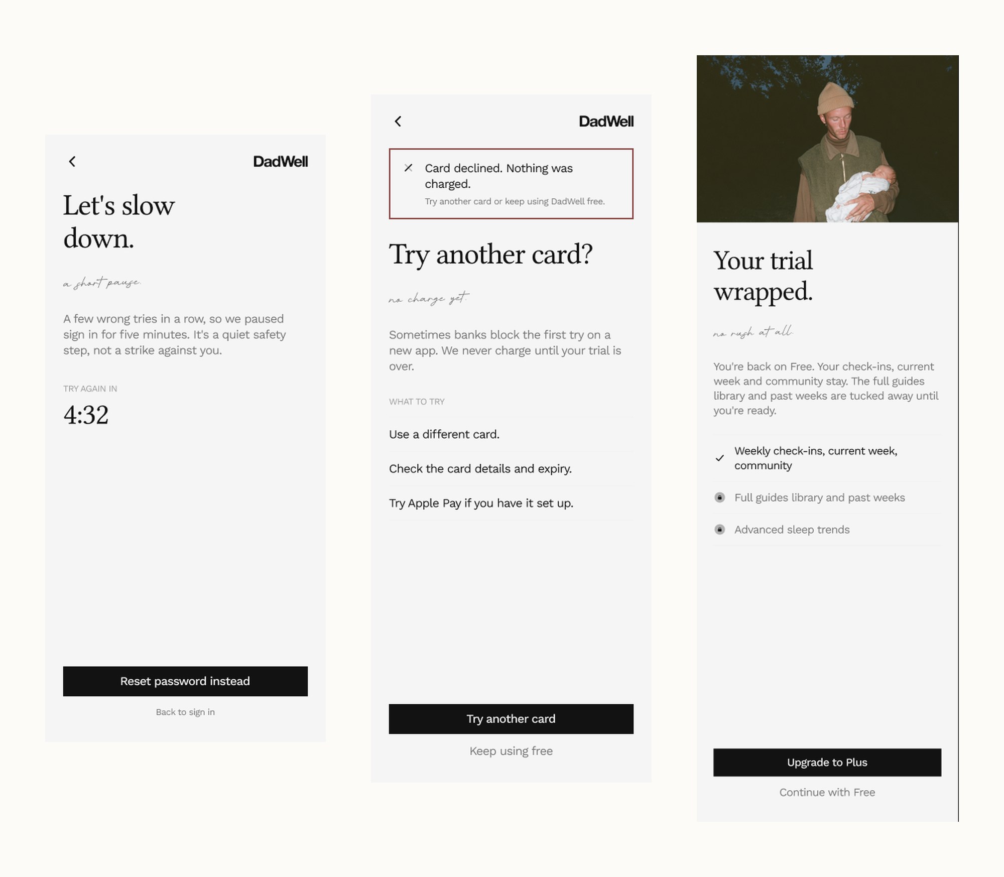
Founding 500 runs at £49.99 a year with fifteen months for the price of twelve, no free trial, and a fourteen day refund by email. Leaving the trial out was deliberate, because a trial on a subscription this cheap costs more in churn admin than it wins in signups.

What shipped
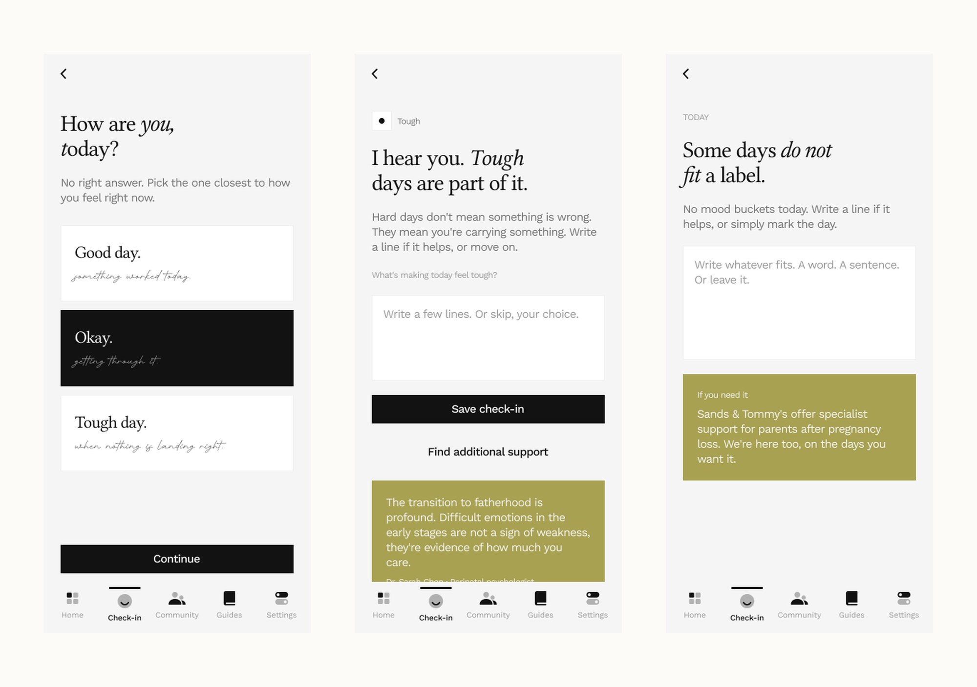
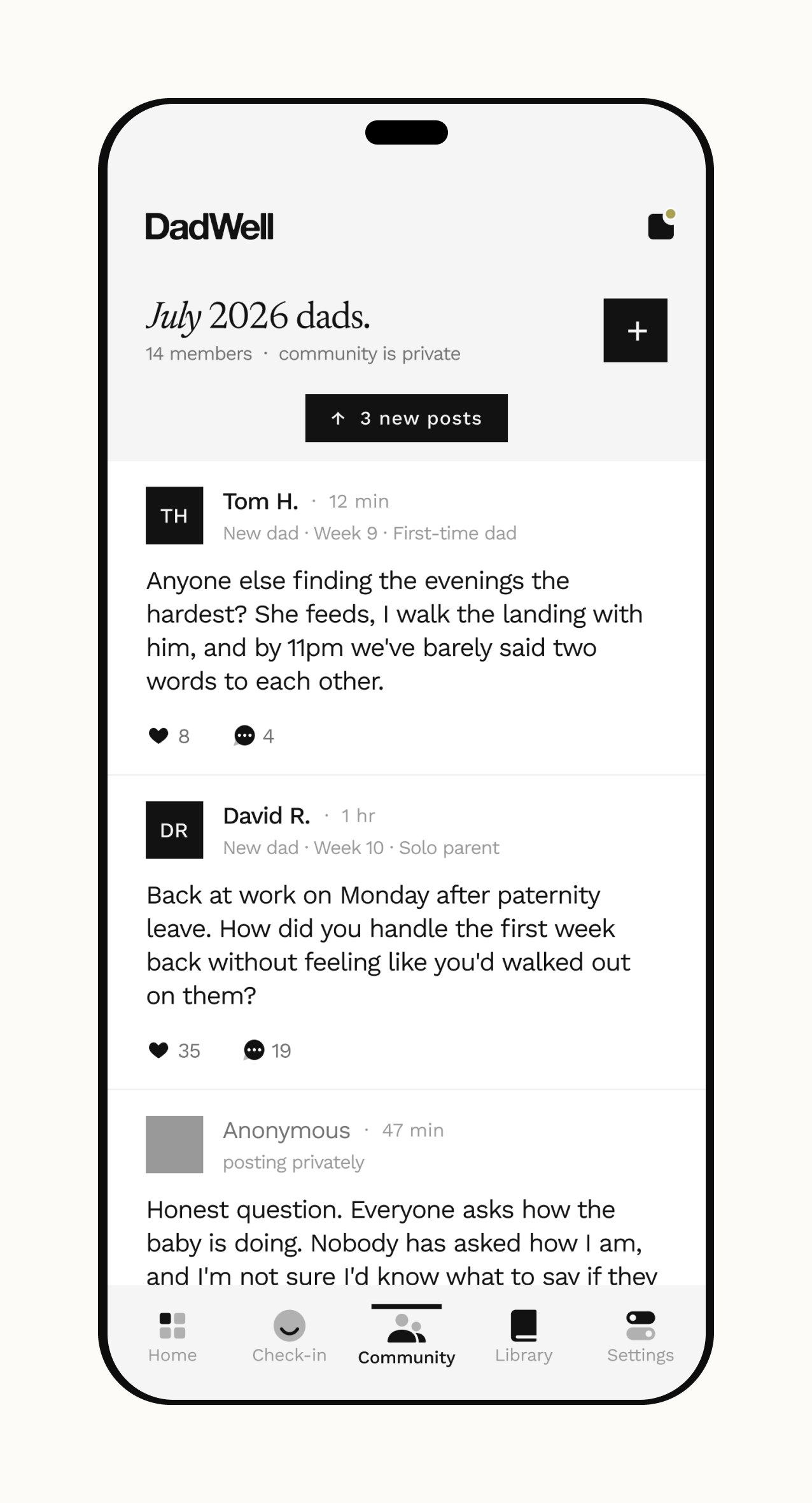
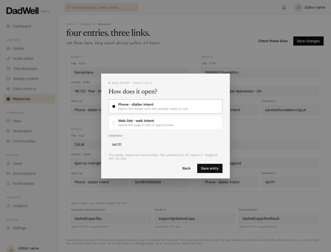
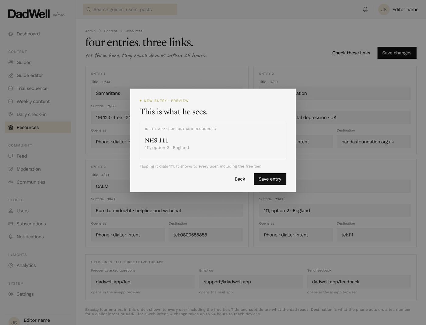
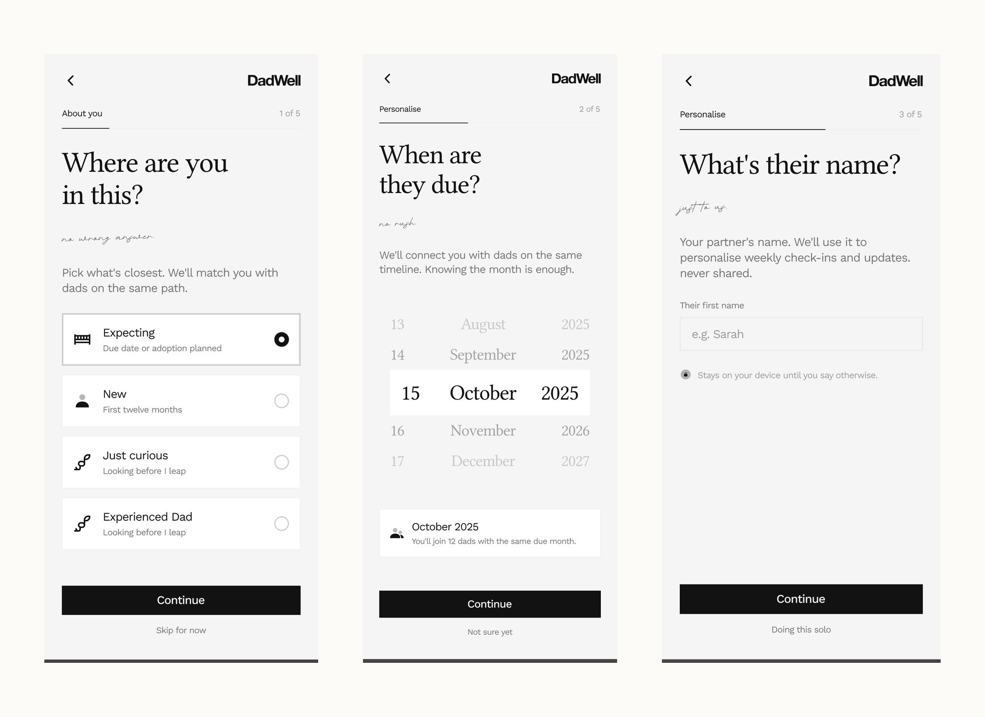
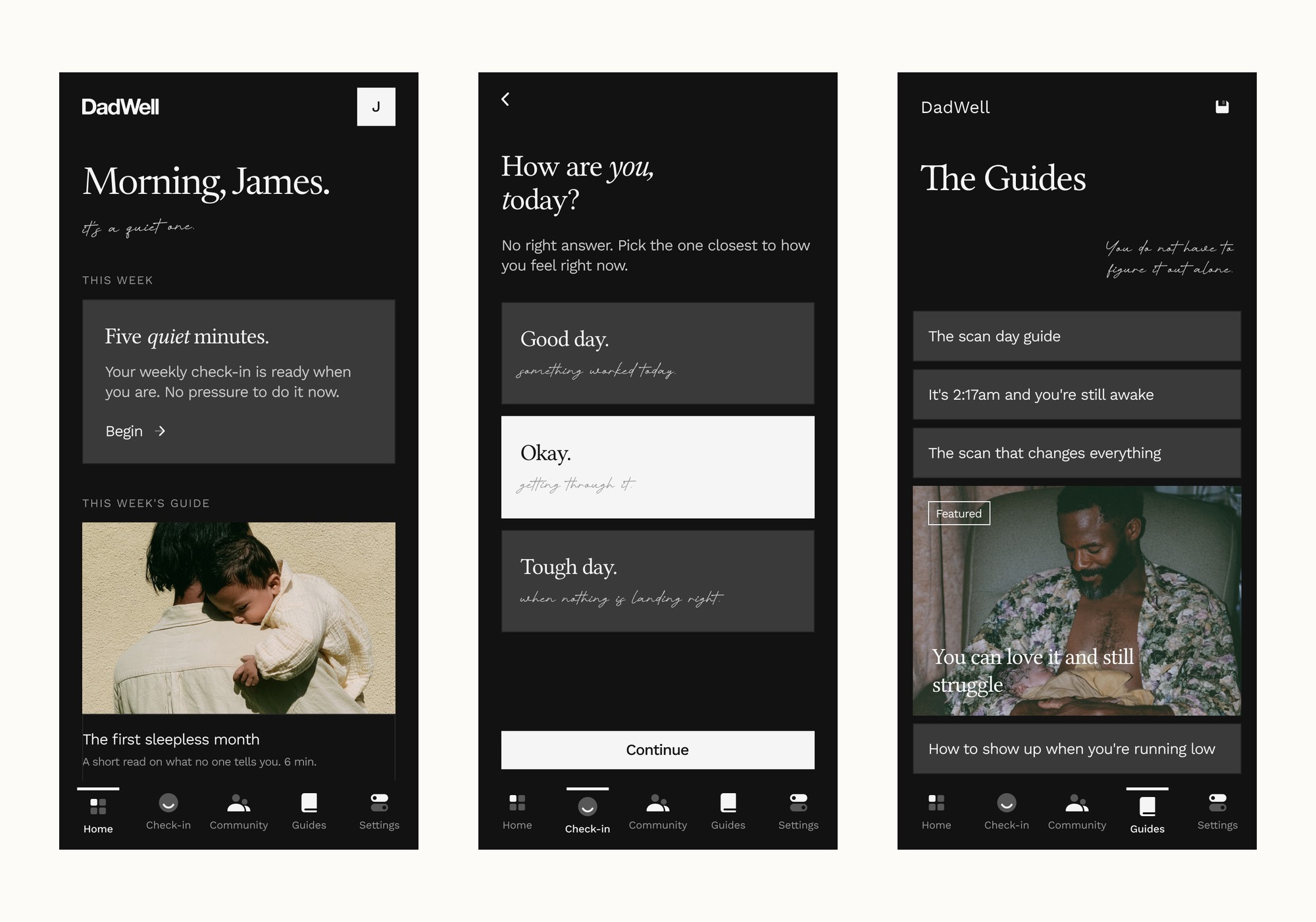
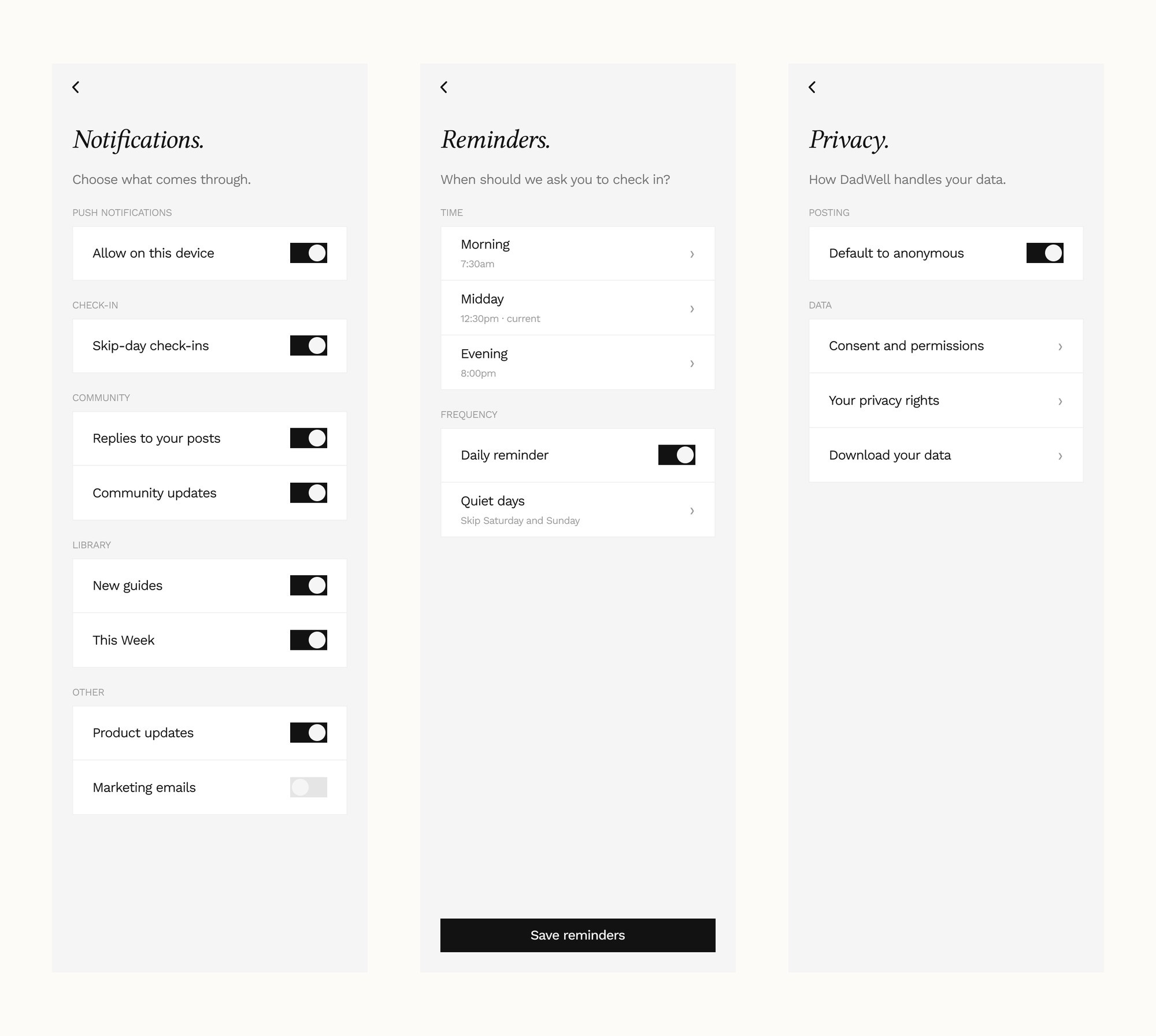
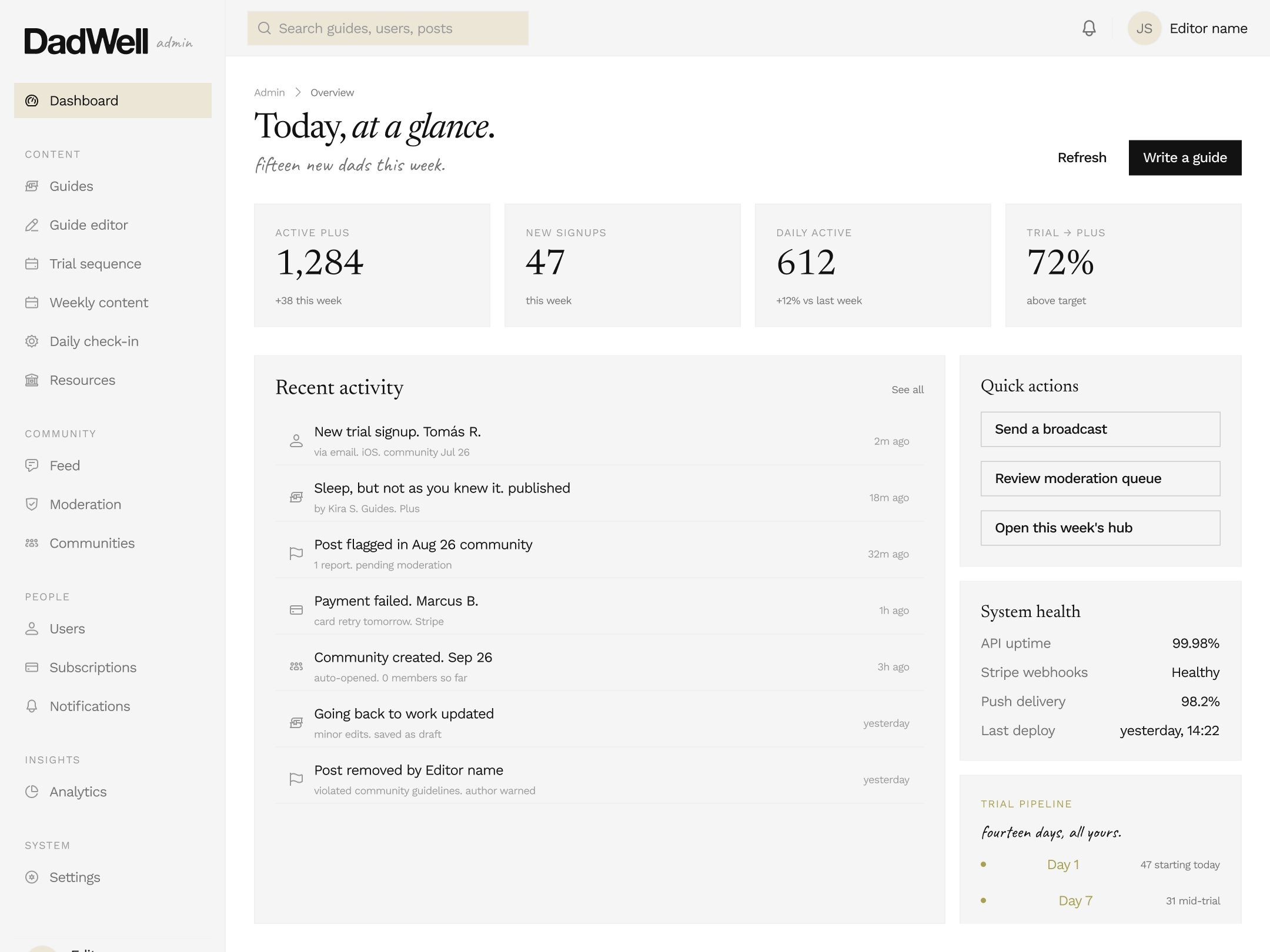
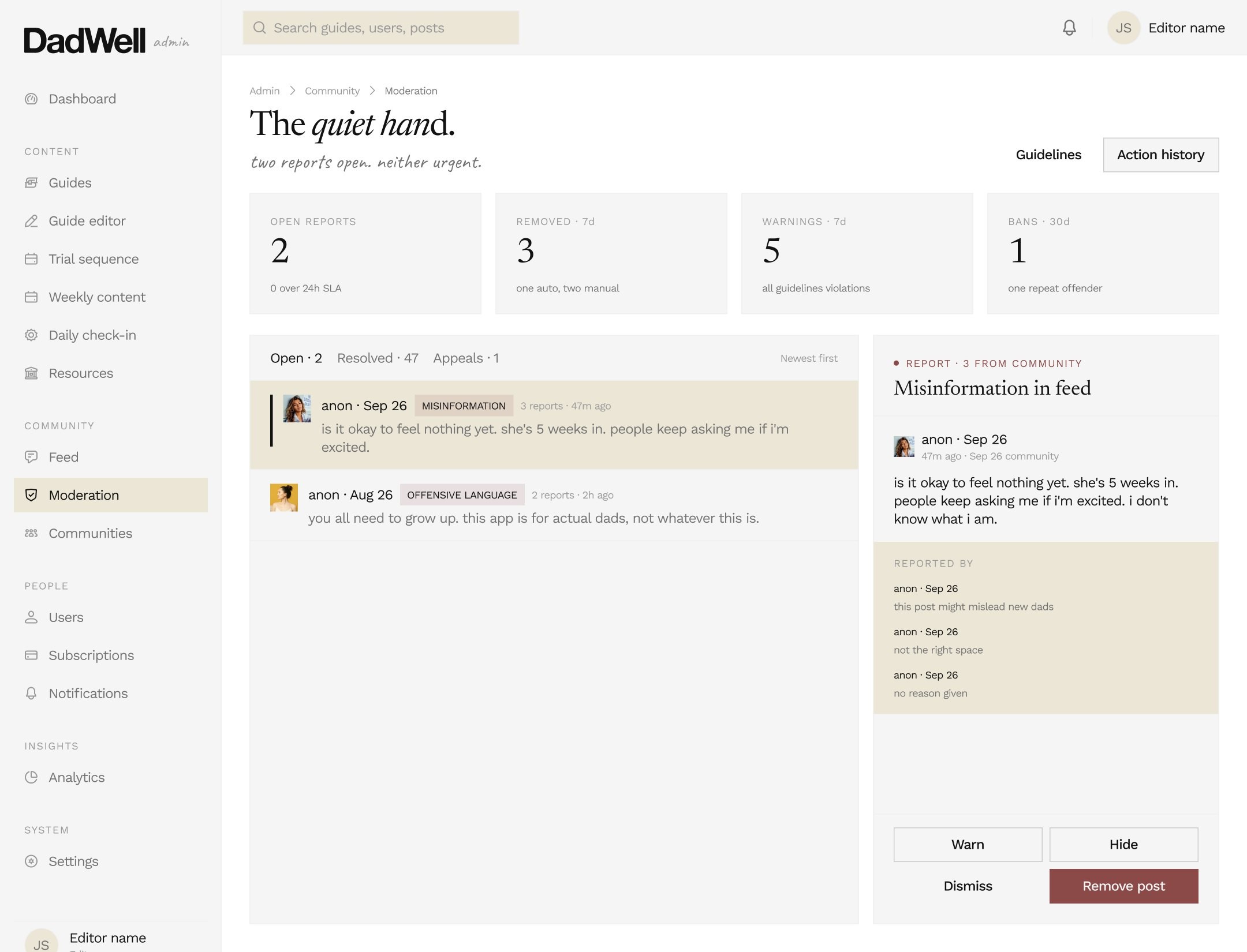
V1 was locked and handed over build ready, carrying onboarding, weekly guides across forty weeks, the subscription paywall, the notification set mapped to the admin panel, and a moderated community, each one specified against the blocker it closed. The product site is live at dadwell.app and the build sits with their team.
How the work ran
I ran this with a product owner and two app developers, and it held together on two habits. The board got reshifted every Monday, so the week started with an agreed order rather than an argument about one. Every Friday one written update went out in the same four parts: shipped, next, need from you, at risk.
Written updates beat calls here, because a template can be filled in by whoever actually did the work, and because “at risk” is far easier to write down than to say out loud on a call. It's also the line that saved the launch date. The EU question sat under it for three weeks before we agreed to cut it.
The thirteen blockers each carried an owner and a date, and none of them was allowed to close until the answer was written down.
The design system
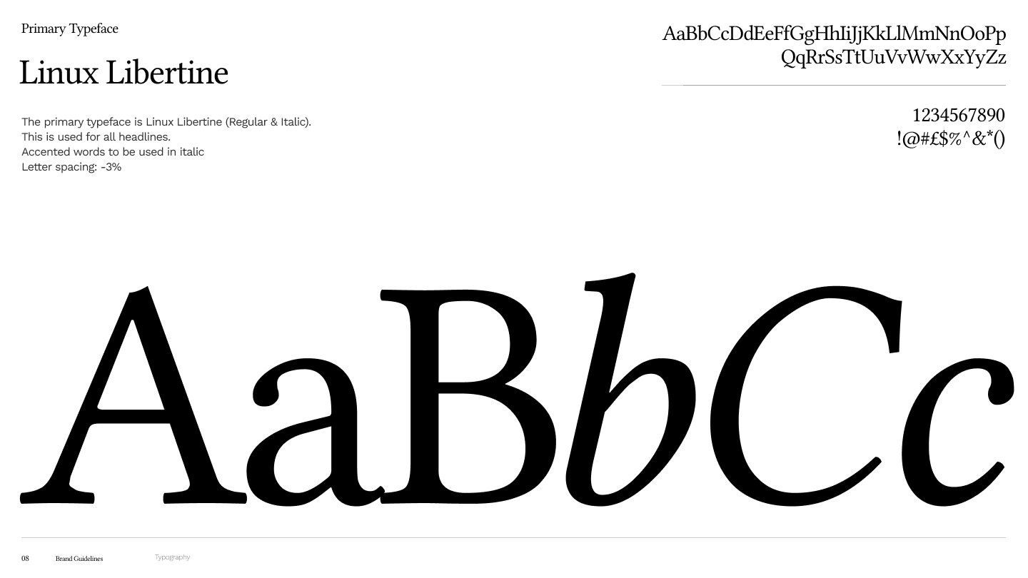
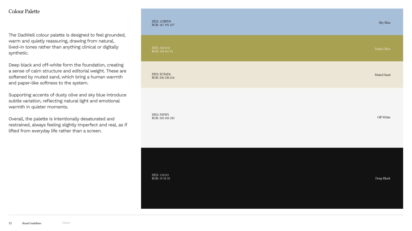
The tokens are semantic and bound throughout rather than hardcoded, so a colour change propagates instead of needing a sweep. Light and dark are built at section level. The brand font couldn't be written through the API, so the swap runs through a plugin workaround that is documented for whoever picks the file up next.
Build and handover
It's a Flutter app on a custom web CMS rather than an off-the-shelf one, which we chose after a build-versus-buy comparison, with RevenueCat for subscriptions and an admin panel for content and moderation. The notification set was specified as a developer-ready document, with each one drawn on a real lock screen so there was nothing left to interpret.