2026, ten weeks
Essor Wealth And Crypto App
Most of the work was deciding what to leave out.
Product design lead
Mobile app
Role
Timeline

Essor is a mobile investing and crypto portfolio for a wealth manager in Paris, designed at 7 Seers Media over ten weeks. Most of the work was deciding what to leave out, and turning the slowest part of the product, which is getting verified, into the part that earns trust.

The problem
Lafont Patrimoine, a wealth manager in Paris, wanted a mobile product for a generation that had started investing without them. France had just had its sharpest return to retail investing in years, and the people driving it were younger and more sceptical than the people the firm already looked after.
The brief was a wealth app. The real problem, when I looked closely, was that finance apps shout. They have dense dashboards and red and green everywhere, and they treat verification as paperwork rather than as the moment someone decides whether to trust you with their money.


What I did
I started with the market rather than the screens
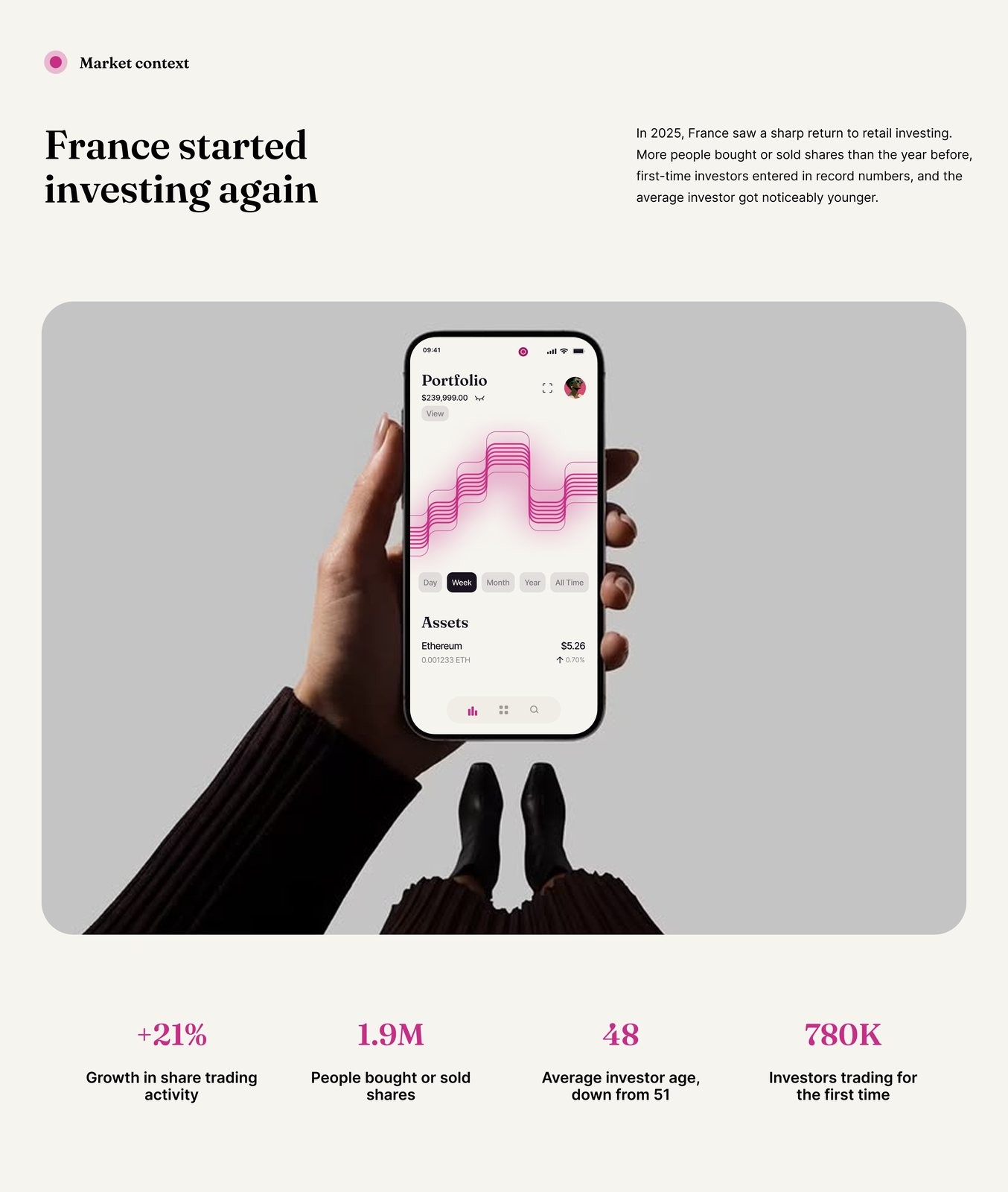
I ran it end to end over ten weeks, and I began with the market, because the argument for the product had to come first. The numbers made the case on their own. In 2025 share trading activity in France grew twenty one per cent, 1.9 million people bought or sold shares, 780,000 traded for the first time, and the average investor age fell from fifty one to forty eight.
I wrote the rules down so they could be argued with
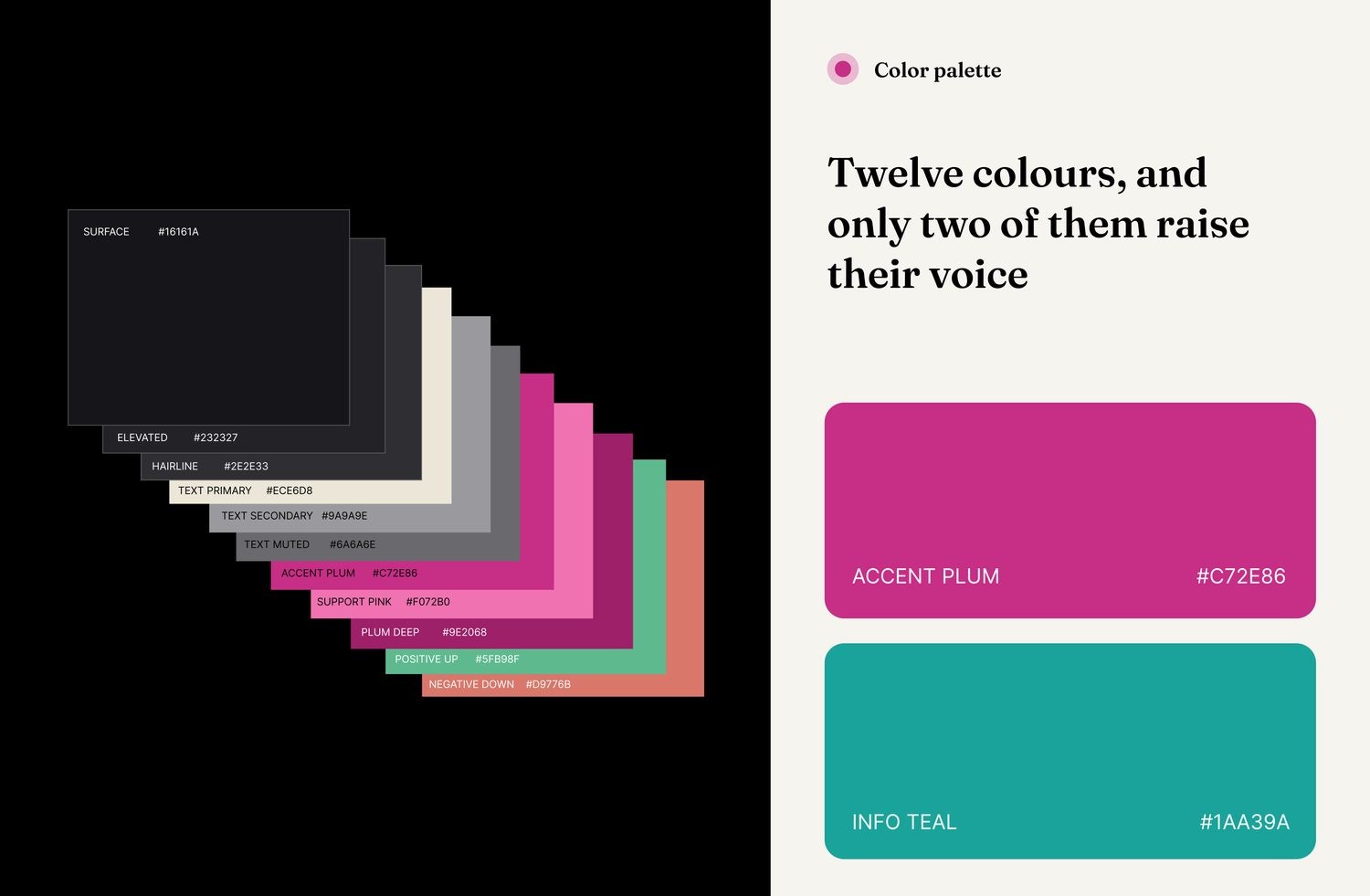
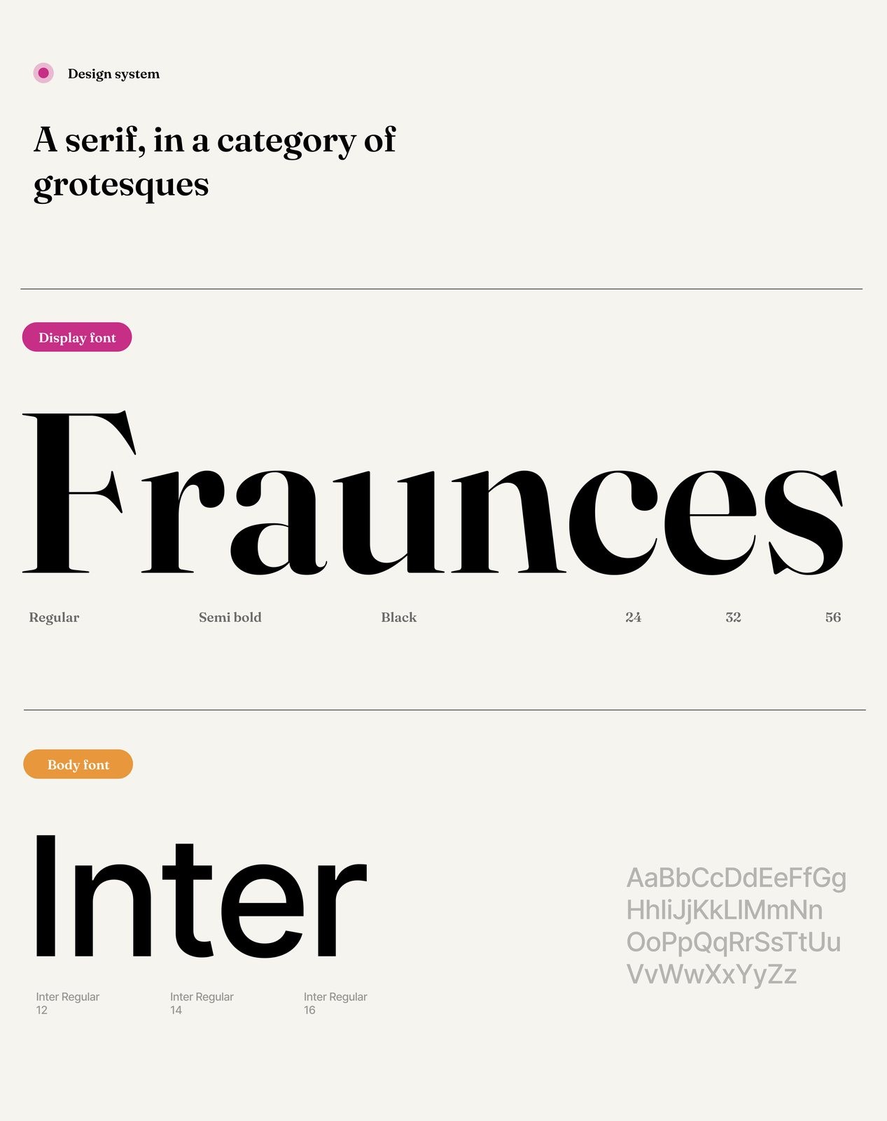
From there I set the rules the design would be judged against and put them in writing, rather than leaving them to be guessed at. There are twelve colours, and only two of them are allowed to raise their voice. I chose a serif in a category of grotesques, Fraunces over Inter, so the product reads as considered rather than loud. The thirty four icons were drawn rather than downloaded, because a borrowed icon set is where a product stops looking like itself.
What shipped
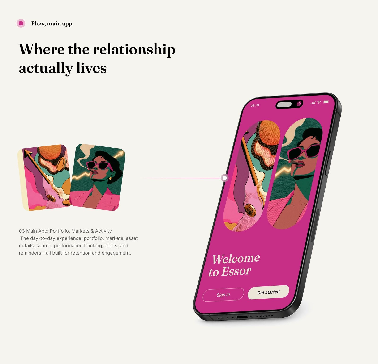
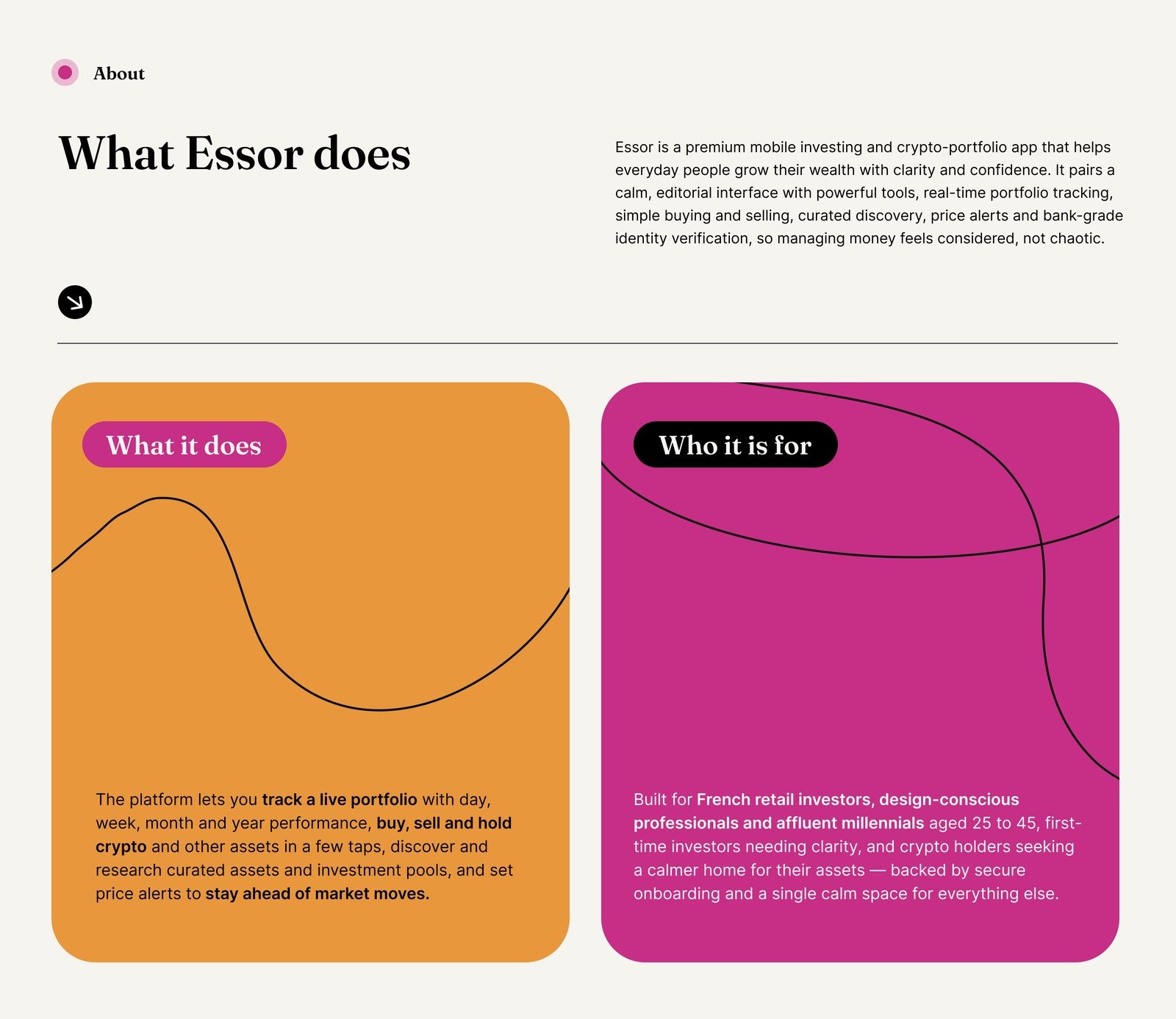
It shipped as an iOS product in dark and light, with a portfolio that reads by day, week, month, year and all time, buying, selling and holding crypto and other assets in a few taps, curated research and investment pools, and price alerts for people who would rather not watch the market all day.
It was handed over as a system rather than a set of screens, so the in-house team could build from it without coming back for a decision.
How the work ran
It ran for ten weeks, with the Paris side reviewing at the end of each one. I kept the decisions in writing: what the product wouldn't do, which assets it would carry at launch, and what moved to a later release. That way each review was about the decision in front of us rather than about what anyone remembered agreeing.
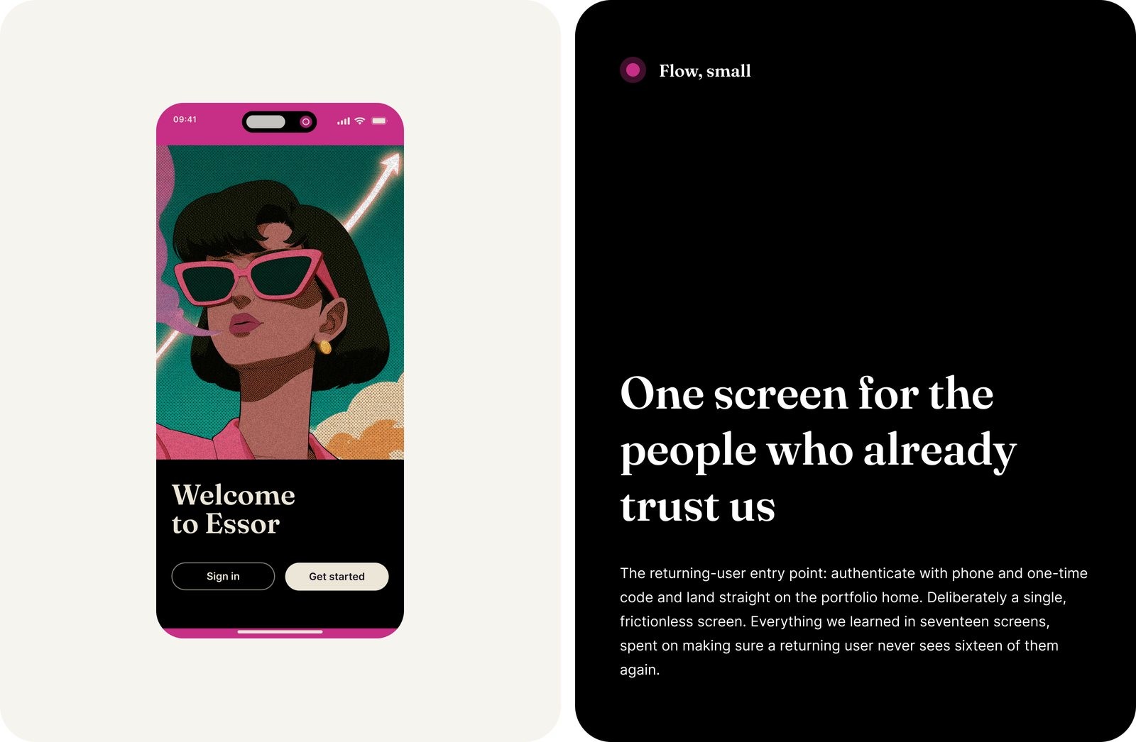
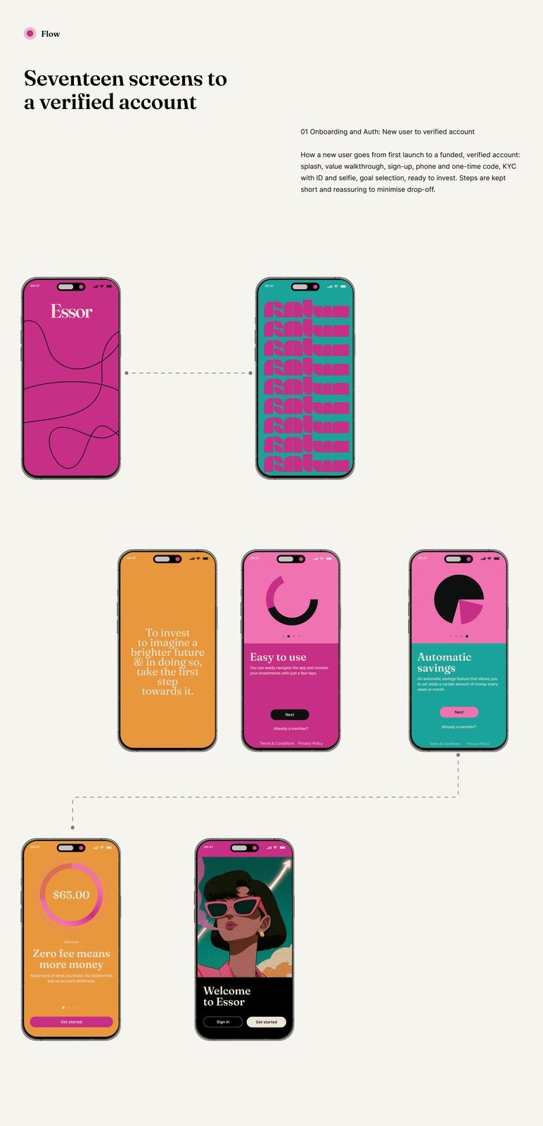
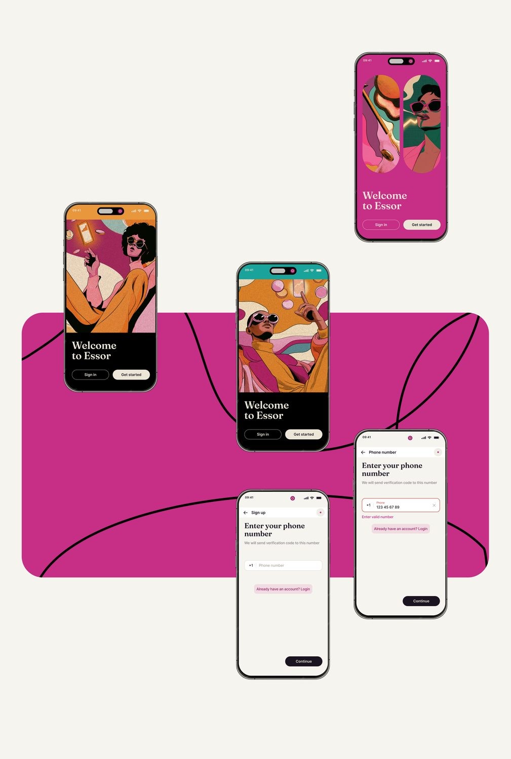
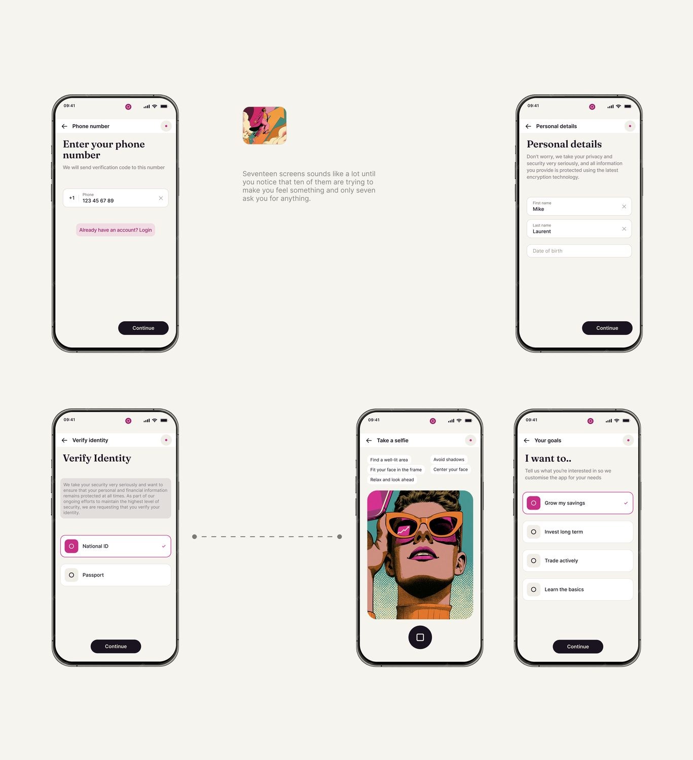
The part that took longest is the part most teams rush. Getting verified takes seventeen screens, and I treated every one as a place the product could lose someone rather than a form to get through. A returning user then sees exactly one screen, a phone number and a one time code, and lands on the portfolio. Everything we learned across those seventeen screens went into making sure a returning user never sees sixteen of them again.
The design system
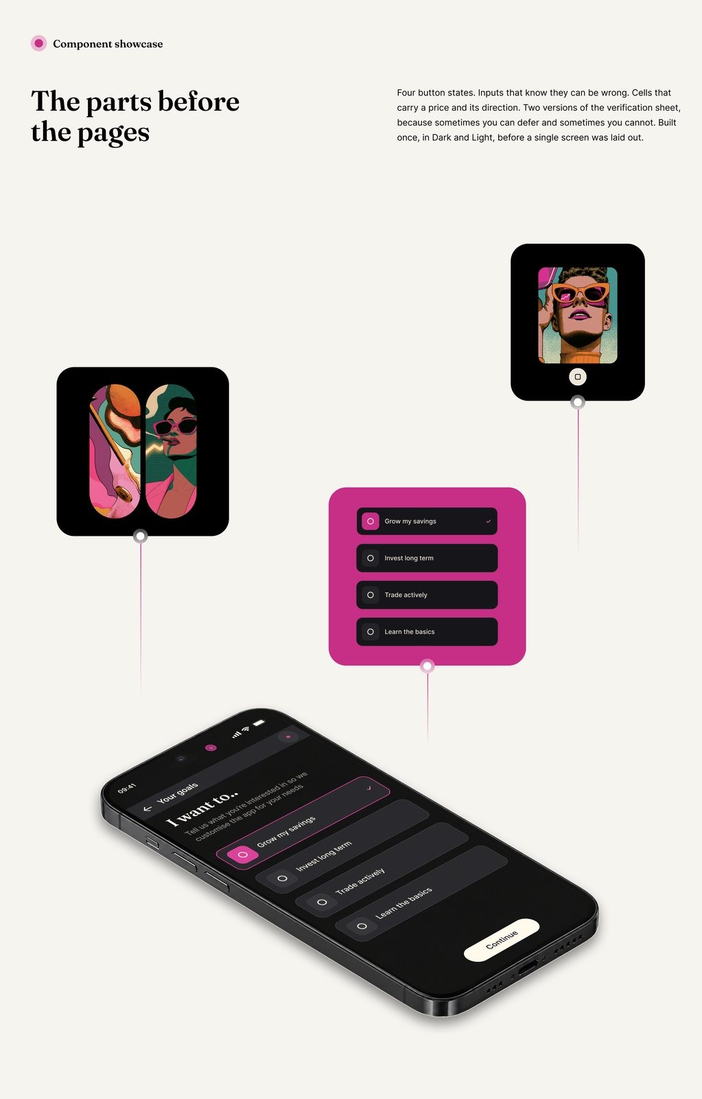
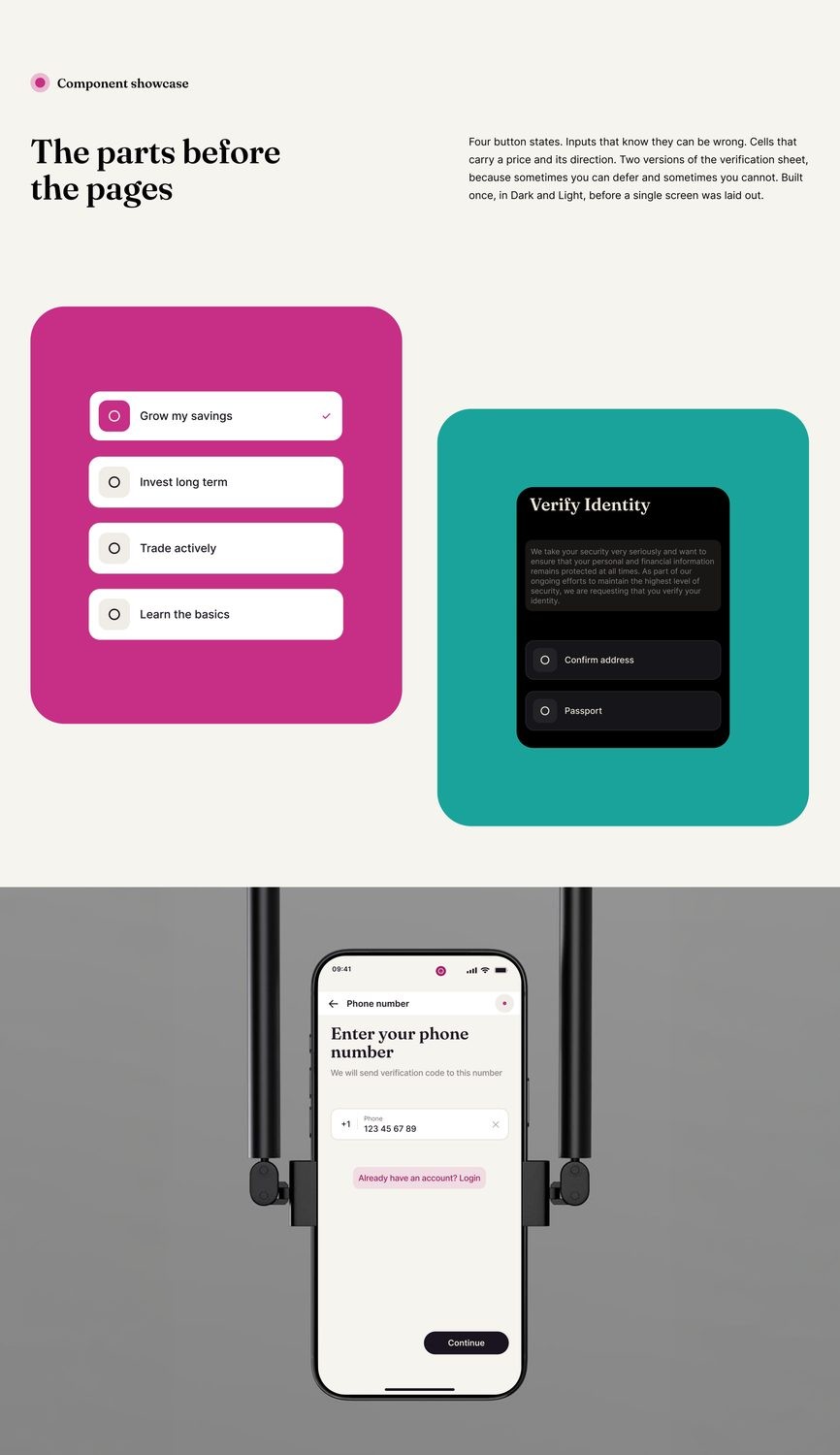
There are twelve colours, with accent plum and info teal as the only two that carry weight. Fraunces sets the display over Inter for the interface. Thirty four icons were drawn for the product. The components, their states, and the dark and light sets all went over together.
Build and handover
The handover was built to be used rather than admired. It carries every component with its states, the icon set as a library, and the rules written next to the screens, so a developer could see why something looked the way it did without asking.